I hate when i have to go 4 links deep to get an explanation of what it even is.
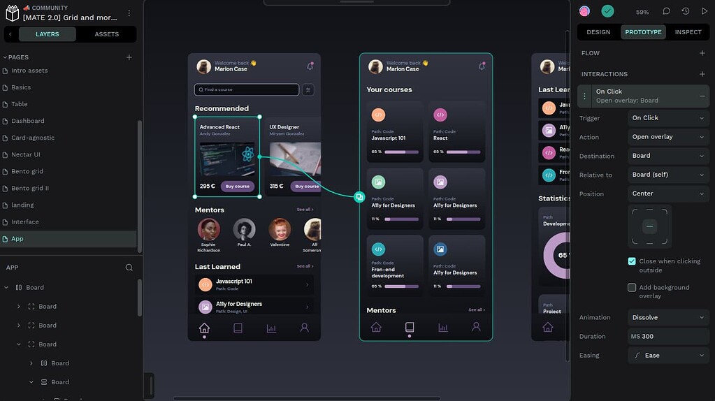
Penpot is the first open-source design tool for design and code collaboration. Designers can create stunning designs, interactive prototypes, design systems at scale, while developers enjoy ready-to-use code and make their workflow easy and fast. And all of this with no handoff drama.
It doesn’t explicitly say so but it’s apparently for people who make web sites. Who would make anything else anyway (I suppose).
It’s vector art. You can design all sorts of things. App layouts, website design, logo design, basically anything that is visual and will need to scale up and down without loss of detail.
That kind of information would potentially be useful on their site’s front page.
Like most FOSS projects… they’re awful at promoting what they actually do on their website front page, instead focusing on FOSS buzzwords. It’s unfortunately a thing.
Thank you. I was also confused
I’m still confused
This shit drives me nuts. “What is x?” Should be somewhere at the top of every software home page. Even if it’s just a header link.
This is personally such a big issue in open source software.
“Blazing fast!” “Enhances your development” “Makes developing exhilarating user experiences faster and easier!”
I DONT EVEN KNOW WTF IT IS!!!
Commercial software does that too. Except there’s a lot more empowering and convergence and whatnot.
For real! The only thing that matches this frustration of trying to find out wtf something is and not just “feel good” BS statements about whatever it might be is surveys. Fuck me am I going to snap one day over fucking surveys on big companies. I hate going to support pages for getting like drivers to install for a PC I am working on and knowing that before I can even press “search” I get a box in the middle of the fucking screen already asking “How’d We Do?” or “Got three minutes to let us know how well we helped you today???” I would try to just start filling them out, but I don’t want to have the very fed-posting-ish words I have for them to be tied to a customer’s PC.
Ignore this unless you (the persons reading this) either don’t understand how fucked so many surveys are as a worker. Just thinking about how much I hate them means I needed a therapeutic rant to get it out. And I am not just going to delete it after typing it at this point. lol
And the surveys that all big companies have are rigged to begin with. They all have either numbers or stars and comment boxes. But depending on the company and situation the rating part might be tied to a specific worker that may have even been the only good part of the interaction. So giving a real “rating” only means that worker is raked over the coals and can be written up. Even if the comments part easily shows this to be the case. The big box chain I fix PCs for does this and my co-workers and myself are constantly fucked over by customers that we were told point-blank that we helped them more than anyone else. But since those customers are fuming about all the other stuff (that was completely out of our control), they give whatever the lowest rating is and the comments about us specifically being good are ignored. All because those comments parts don’t really matter to high-er level managers and corporate. Can’t be removed from our metrics as being clearly about something else. So it just becomes about “well it means you will need to get more positive ratings to cancel it out”.
And as a customer, they use the whole “concern about wanting feedback” as 100% go ahead to just spam the ever living shit out of your txts, email, and even start harassing via calls that they force workers to make. FUCK SURVEYS so much from both a worker and customer standpoint! I volunteer to be the executioner of the people that make this shit a policy of a company (and of course the CEO, other C level folks, and every single member of their boards once the revolution comes.
It’s especially annoying when it’s on a subdomain that has no links to the primary web site. e.g. when clicking the company logo in the header of a blog entry at
blog..comtakes you toblog.company.cominstead ofwww.company.com.Edit: Sorry, didn’t occur to me that that’s a real web site and it would be auto-hyperlinked. I think I fixed it.
To be fair, the linked site does a decent job of saying what it is/does
Didn’t really look at it, if I’m honest. Just expressing general dissatisfaction…
The linked blog post? I can’t find a word about what it does in it. Only how amazing the new version is and how difficult it was to make it. You can kinda guess from the post the purpose of the app, but nothing explicitly given
Should’ve explained it to me man. I don’t want to go 4 links deep.
Well, I didn’t like having to wait for their Discourse forum page to load myself. I added their Fediverse account link as well to ease discomfort.
Design and code beautiful products. Together. Penpot is the web-based open-source design tool that bridges the gap between designers and developers.
That’s a lot of words for so little information.
WYSIWYG collaboration platform, I guess?
Looks like “open source Figma.” If so, great!
It’s open source Figma
Which is a bit ironic for people that make UX/UI software
I wouldn’t expect a blog post to explain what it is, as they’re generally designed for people aware of the project. I doubt they’re the ones that posted it here. Instead of clicking links, I just went to the main site and very quickly understood what it was.
Some sort of marketing bullshit generator I assume by the text of the post?
This blog post is pretty buzzword-heavy, but Penpot is a legitimately great tool. It’s used for UI design and layouts. I’ve seen a couple of open source projects use a self-hosted Penpot instance for working on and discussing new designs.
Figma would be the most popular, proprietary example of this type of tool. I’m not aware of any open source competitors besides Penpot.
edit: It’s like Google docs for web page layouts or app layouts. The animation on their homepage is probably the best way of showing what it does.
Is… is this the comeback of WYSIWYGs?
Ui design tools are not used to build actual apps and anyone trying toake them do that is a fool. It’s for designing apps.
Did you read the new features? CSS and HTML component testing, complete with web scalability (I.e media-query). Sounds very WYSIWYG to me.
But yeah, I know it’s an open source Figma, because Figma can ligma balls.
Heh, ligma. Nice.
There’s no logic in any of that. CSS and HTML component testing is just automating the designer/dev hand off. You can’t make a functional app with it. And it’s not appropiate as a content editor so doesn’t even rise to the WYSIWYG abilities of something like Wordpress Gutenberg full-site editing or Squarespace.
In my day, son, a WYSIWYG spat out HTML and CSS. It was up to you to integrate it.
Ah yes I forgot. That was very slightly before my time in the industry. Remember playing around with komposer in college.
That said Penpot can’t even create links or do any sort of routing. It’s not spitting out html and css. It’s spitting out specs that devs can use as reference when coding. PowerPoint is a more robust wysiwyg than penpot by a basic functionality measure.
love it! Amazing work!
Does it have component variants yet?
Great, now let us know what’s on the roadmap for Taiga
What does it has to do with Taiga?
Same company makes it, last I heard they announced big plans for Taiga, and then it’s been crickets.
Maybe this has changed, but I haven’t seen anything recently.
Quite cool!
Looks cool! :)
Those OSX screenshots really are selling me on this being a FOSS thing I could get behind /s NOT!!
Because windows is more open source than mac os? How many designers use linux? The Mac os screenshots is their target audience of designers and plenty of mac users prefer open source apps
Still, why not support Linux? Half of the work is already done, probably
Penpot works perfectly on Linux, and you can even host it yourself in your own computer if you want. It’s web-based and works in both Firefox and Chromium browsers. (I think WebKit ones too, but it’s been a little while since I’ve tried it with Epiphany.)
I use Penpot myself all the time on Linux, but I’m usually using the hosted version so I can collaborate with others without having to maintain a server. I have also run locally in a container using Podman, even with Podman’s rootless support.
But to start using it, all anyone needs to do is point their browser of choice to https://design.penpot.app/ and sign in. There is no setup process or installation needed; self-hosting is completely optional.


