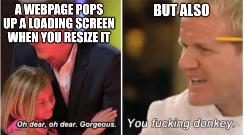
Ephera@lemmy.ml to Programmer Humor@lemmy.mlEnglish · 2 years agoStill wild to me that we built webpages like thislemmy.mlexternal-linkmessage-square9linkfedilinkarrow-up10arrow-down10
arrow-up10arrow-down1external-linkStill wild to me that we built webpages like thislemmy.mlEphera@lemmy.ml to Programmer Humor@lemmy.mlEnglish · 2 years agomessage-square9linkfedilink
minus-squareEphera@lemmy.mlOPlinkfedilinkEnglisharrow-up0·2 years agoWell, the situation you describe, is probably best handled by CSS media queries. In case you’re not familiar, you can write: @media (width < 800px) { h1 { font-size: 110%; } } …to get smaller headings on mobile, for example. But yeah, reality may be more ugly. Especially, if you’re using a bulky JS framework, it may be easier to do the JS dance.


Well, the situation you describe, is probably best handled by CSS media queries.
In case you’re not familiar, you can write:
@media (width < 800px) {
  h1 {
    font-size: 110%;
  }
}
…to get smaller headings on mobile, for example.
But yeah, reality may be more ugly. Especially, if you’re using a bulky JS framework, it may be easier to do the JS dance.